5 warning signs that your website is scaring away mobile shoppers
Is your ecommerce website mobile-optimised? And if not, when was the last time you looked at it on a phone?
You may be scaring off customers without realising. Here are the top 5 warning signs that mean your site is off-putting to potential customers on mobile.
1. You have a very high mobile bounce rate.
Check your analytics. You’ll probably see a significant number of visits from mobile users.
Now dig down so you’re looking at users on smartphones, and find out the bounce rate. How’s it looking – especially when compared to your desktop bounce rate?
Desktop websites often work well on tablets, so unless you isolate phones, you might not be seeing the complete picture.
It’s hard to give exact numbers for a reasonable bounce rate, as every business varies, but if you’re seeing a big difference between mobile and desktop, you could have a problem.
Average retail bounce rates are between 20-40%, but this can be higher on mobile. So make sure you compare different devices and track over time.
2. You use the same pop-up banners everywhere
Take a look at your offer banners. They may work brilliantly on your desktop site. But have you tested them on mobile? Chances are, if your site’s not mobile-optimised, they’ll be tiny (at best) and impossible to close (at worst).
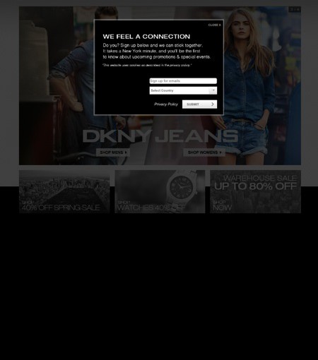
Here’s an interesting example from DKNY. You have to zoom in to close this shipping announcement as soon as you visit the site.

And then what do you see? That’s right, another banner you have to zoom right in to get rid of. By this point potential customers will probably have lost interest.

This isn’t even the worst example we’ve seen – that would be a banner that moved around the screen when you zoomed, making it impossible to close. Worse still, you couldn’t navigate to any other screen while the banner was there, making the website unusable for would-be shoppers.
The moral of the story is, check your banners on mobile!
3. Your homepage features acres of white space
This is a telltale sign of a non-responsive mobile site. Vast tracts of white space. Take a look at these examples from Motel Rocks and Nails Inc – fully half the screen is just a blank canvas.


This is a loud and clear message to shoppers that you’re not mobile-friendly, and many of them will just give up. Some may revisit your desktop site, but others won’t come back. They’re customers you’re missing out on.
4. Your site on mobile has tiny text and even smaller links
Here’s a prime example from Liberty. There’s no white space on the screen, which is good, but can you actually read any of the calls-to-action? Especially underneath the ‘Sales Picks’ section. It’s like an optician’s eye test chart.

Here’s another example from La Redoute. Check out the category menu at the top. It’s only readable if you zoom in, and then you need to swipe from side-to-side to read it all.

Compare to this mobile website we made for LUCZA, where all the categories are instantly visible.

5. You have a long, drawn-out checkout process
Checkout on mobile needs to be short and sweet. You can minimise the pain to consumers by having nice big fields to fill in, large buttons to click, and a clear progress indicator. You can also offer a Paypal option so customers can easily login to their account.
One big no-no is asking people to register before they checkout. Here’s an example from Very. Not only do they ask you to register as a new customer, but if you’re not careful you’ll end up signing up for credit too.

For more on the dos and don’ts of mobile checkouts, have a look at this comprehensive Econsultancy round-up.
How to stop scaring off potential customers
If your site shows any of these warning signs, you’re missing out on potential customers. Even if these people are just browsing and never buy on their phones, you’re making it impossible for them to access a vital step in the user journey.
To reduce your bounce rate and get more sales on phones, a mobile-optimised website is a max.