Why do online fashion brands love sliding banners?
Are you a carousel fan?
No, not the fairground variety with the revolving horses. We’re talking homepage carousels – those moving slideshows that feature on the front page of nearly every fashion retail website. They’re also called ‘sliders’, ‘sliding banners’, and ‘rotating banners’.
Here’s one from Boohoo.com to refresh your memory.

The image changes every 4 seconds to a different one, or users can skip between images with the arrows at the edges of the screen.
Fashion retailers love these sliding banners, but web developers and specialists in ecommerce hate them. They really do.
For example, there’s research here from the Nielsen Norman Group showing that carousels ‘annoy users and reduce visibility’. Peep from Conversion XL has an in-depth article here, concluding that carousels actually reduce conversion rates on ecommerce sites. And here’s an article from Econsultancy that calls them ‘a waste of valuable space’.
What are the main objections to carousels/sliding banners?
- Too much information – you’re confusing the user by hitting them with several messages at once.
- Poor usability – often the user has no control over the rotation, or only by using small radio buttons, which can be difficult to see and use, especially on mobile.
- ‘Banner blindness’ – the images just look like an ad to users, who subsequently ignore them.
- Poor accessibility – they’re really not good for users with accessibility issues.
So why do fashion retailers use them so often? To figure out the reasons behind their popularity, we’ve examined some examples of sliding banners from UK fashion retailers, looking at both their desktop and mobile sites.
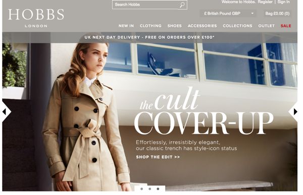
Fashion retailers using sliding banners/carousel – Hobbs
Hobbs have a classic carousel homepage. Each panel features a large image, minimal text, and links to an edited selection of products. It changes about every 5 seconds, and has navigational features including radio buttons and arrows. If you click on an arrow, the automatic rotation stops.

The Hobbs website is divided up into categories like the ‘Workwear Boutique’, presumably to make browsing easier, so this homepage design does reflect their site layout. Their extensive drop-down menus and filtering system make it simple to find a specific product or section if you’re not there to browse.
The Hobbs mobile site has exactly the same sliding banner, but with the pictures cropped to remove the copy except for the title. The only problem with this is that the images appear very low-res and slightly pixelated, as you can see below.

Topshop love editorial content
Topshop use carousels/sliding banners very interestingly. Sometimes their homepage features an automatically revolving carousel with 5 images. Earlier this week, for example, they had five images linking to editorial content rather than direct product links (like this analysis of fashion tribes).
Today though, they’ve changed the front page to a video about their Google+ collaboration for LFW, and the carousel doesn’t automatically rotate. Instead users have to click through with arrows, to see info about the launch of their LA shop and an interview with Kate Bosworth on her style.

This suggests that Topshop, as you’d expect, have a well thought-out homepage strategy and change their sliding banner according to their needs.
It’s interesting that the images on their banner often link to editorial content rather than product. Clearly, they’re looking for engagement from their customers. After all, they already have high brand recognition, so it makes sense to draw in consumers using their wealth of editorial content rather than giving a hard-sell message.
The Topshop mobile website also has a sliding banner but it’s much smaller and updates less frequently. It also highlights product rather than editorial, like this image leading to a selection of croptops.

No carousel for Net-a-Porter
What about those fashion retailers that don’t use a sliding banner? Like Net-a-Porter for instance. Here’s a screenshot of their homepage.
Like Topshop it’s heavy on editorial content, currently highlighting their new online magazine ‘The Edit’.

So although they’re not using a carousel, their homepage features a wide range amount of information and links to click on. (Whistles are another site using a similar magazine-style homepage, following their recent re-design.)
Now take a look at the Net-a-Porter mobile site and app homepages. These are very different – both link directly to product categories. The editorial content is still there in the app, but it’s hidden underneath the ‘News’ icon on the bottom.

That’s the website on the left, and the mobile app on the right.
When we’ve conducted consumer interviews with mobile shoppers, they’ve backed up this strategy, saying that ease of finding products is the first thing they look for in a mobile app. So it looks like Net-A-Porter are wise to differentiate their desktop and mobile sites like this.
(Although neither Net-A-Porter or The Outnet have a homepage carousel, Mr Porter actually does. Would be interesting to know why that decision was made).
ASOS keep it simple
Finally, another fashion retailer without a carousel – ASOS.

Their homepage is clean and simple – no editorial, no carousels, just links to their women’s shop and their men’s shop, and an emphasis on their wide variety of product and free shipping.
It’s a contrast to most other UK fashion sites, but they must be doing something right. Although you might notice that when you click through to the women’s section – yep, there’s that sliding banner again.
Fashion vs conversion experts: who’s right about carousels?
So is there something special about fashion that makes carousels the right choice? Or is it just a case of retailers jumping on the bandwagon? Let’s have a look at some of the things that might make fashion retailers opt for a carousel.
- Fashion is visual. Sure, all online shopping requires good pictures, but fashion is solely about image. Carousels are an effective way to showcase beautiful pictures.
- In fashion, new = good Fashion relies on new product and new features. Most fashion retail sites get a lot of recurring visitors who are browsing to see what’s new. Carousels can highlight lots of different features/products without sacrificing the clean look of one big image.
- Most fashion sites are similar They nearly all have the same layout – logo at the top, then a navigational bar with links to different product categories, and then a large image underneath. Fashion shoppers are used to this layout, so carousels don’t confuse them – if they’re looking for something specific, they know where to go.
- The magazine effect Perhaps the carousel look is influenced by the fact that fashion consumers are used to seeing products in this context – flipping through magazines or reading blogs which have constantly changing posts. Sliding banners provide a similar effect for ecommerce.
- They’re easy to update Especially for smaller fashion brands. It’s simple to source product or model shots, layer some text on top, and put them into a sliding banner. It makes the front page look fresh, and the brand can update images themselves without paying for extra development work. Here’s an example from independent retailer Lazy Oaf.

Making the most of carousels – top tips
So if sliding banners are here to stay, how can fashion retailers make the most of them?
- Don’t forget about mobile Carousels can look terrible on phones, and they’re frustrating to navigate on mobile. If your homepage features them, you need to get a mobile website too, one that’s specifically formatted for smartphones.
- Test on tablet On the other hand, these banners can be perfect for tablets, which are ideal for viewing large images. But test to make sure they work and are swipeable.
- Keep the user in control Includes navigational features like arrows to click left and right, and visible radio buttons to show how many slides there are. A pause/play button is good too.
- Change it up Follow Topshop’s example and keep evaluating your homepage content. If you find that hardly anyone is clicking on the images, they might be ineffective. Try a static image for a while to see what happens to your clickthroughs and conversions.
In the end, the fashion-specific advantages of this homepage layout seem to outwegih the disadvantages. Fashion consumers are searching for inspiration on retail sites, so information overload isn’t a problem. ‘Banner Blindness’ isn’t as common either, given how familiar fashion shoppers are with this site layout. Usability worries can be fixed by adding navigational features like arrows. Accessibility does remain an issue though, and it’s something that fashion brands should consider more.
This doesn’t mean that carousels/sliding banners are appropriate in all situations. A homepage carousel shouldn’t be a compromise made because you can’t decide what messages to highlight. So think carefully before introducing one to your ecommerce site.