Why every fashion retail website looks the same

Have you noticed that nearly every fashion retail website looks the same?
They all have:
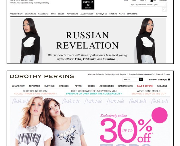
- Black text on a white background
- Category list in a line along the top
- Checkout bag in the top right hand corner
- A big old carousel/sliding banner front and centre
- All other information in tiny black text at the bottom
Check out these examples:
Yes, you can find outliers, but they’re exceptions to the rule. Why is this? Don’t retailers want to stand out?
Why does fashion retail websites look the same? Google can explain
Google released a very interesting study last August that explains exactly why this familiar layout works.
Their user experience researchers wanted to find out exactly what makes people like or dislike a website. You know, that gut feeling of either ‘seems legit’, or ‘no thanks’ that you get milliseconds after clicking on a link.
What Google found is that users like websites to be simple and familiar. They (or rather, we) want websites that look like every other site in the same category. You can find the research here with more information.
This helps to explain the ubiquitous sliding banners, despite the fact that many people describe them as a total UX no-no.
Google’s research shows that users prefer a ‘prototypical website’ (ie. one that looks like all the others in the same category) and a simple layout, both of which are fulfilled by this homepage carousel layout.
Is it better to stand out or blend in online?
Be careful of anyone who advises you to make your online store ‘stand out from the crowd’. On this evidence, that’s exactly what you don’t want to do.
It makes sense. Imagine walking into a shop and seeing all the clothes hanging from the ceiling, only reachable by ladder. Or the checkout hidden in a cupboard along a winding corridor. You wouldn’t stay long. And you’d tell your friends to stay away too.
It’s the same online. Customers want to look at your products and then buy them, not spend an age figuring out how exactly to do that.
How does this apply to mobile?
Although Google’s research didn’t include mobile apps, we think the same principles apply.
There are some functions that users now expect when mobile shopping. Simple things like a search function, the ability to swipe left-to-right between pictures, zoomable product photos, and shopping menus accessible right from the homescreen.
We’ve built all these into our mobile commerce platform after testing them on fashion consumers (with consent – no shoppers were harmed in the making of our apps!).
What does this mean for my website?
If you want your ecommerce site to look trustworthy, think twice before installing that jazzy floral backdrop. When it comes to online shopping, simple and recognisable is good.
Invest in product images and branded content, and let them do the talking, rather letting your website structure take centre stage.


