Three of the best iPad fashion apps
iPad apps are an interesting space. With larger screens and more powerful internals, Apple’s tablets offer developers a plethora of opportunities to innovate and expand their online presence. In this post, we look at how three different fashion brands (Boden, Forever 21, and L.L.Bean) have utilized the iPad in their attempts to monetize the device.
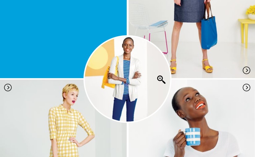
Boden:

Boden’s app focuses on featured items. Upon opening, the user is given full views of gorgeous outfit shots over clean backgrounds.

Swiping the bottom of the page leads to an order button, but tapping this content does little more than redirect to the brand’s website, making the entire trip nearly useless (unless the original outfit is perfect). It’s also a really slow transition between app and online store.
Unless you’re looking for exactly what’s displayed, the Boden app actually detracts from the website experience (the regular site loads faster without a splash screen). In this sense, the app is really nothing more than a very-limited catalogue.
Boden has implemented its features well, but there aren’t that many to consider. Finding a recommendation is easy, but shopping around is difficult.
Forever 21:

Forever 21 also splits their first screen into large images, but they’re more obvious and useful than Boden’s. The largest one (on top) redirects to a page on the website, which is based on a similar concept as Boden’s interactive catalogue.

Forever 21 improves on Boden’s design by offering the outfits in a row and then dividing the products much more quickly. It’s disappointing that this is on the website rather than the app, but at least it’s actually useful and gives the shopper a lot of options (the carousel of outfits scrolls and does so briskly).
New arrivals directs to a simple menu.

This is a very direct set of photos with prices attached: no product detail. It’s designed to be approachable, and succeeds in pushing the the affordability over complexity of the Forever 21 brand.
Deals

The sales section is a little wanting. The offers (for some reason) only occupy the top third of the screen and just link to deal pages on the Forever 21 website. The shop icon on the bottom essentially does the same thing, there is no in-app shopping experience at Forever 21.

Finally, there’s also this cool little store finder which could be useful for mobile consumers looking to try something on or see it in person (not many locations near London though).
Anthropologie:

Unlike the previous two brands, Anthropologie opts for a horizontal orientation and relatively blank start screen. The buttons are clearly labelled and described, and the user has no confusion as to where to go next. Shop is, of course, the leftmost button.

The shop opens into a display of various items organized into categories. Notice how this can be adjusted to display more or fewer images, and all of this occurs within the app: the transition between pages snappy and logical.

Product detail is still within the app, no redirect to the website here.
Outside the shop, the Play icon gives users the ability to arrange products in ways that correlate and match.

Users can even place their own photo in the top left corner to compare it to the rest of the items.

The Social tab streamlines access to Anthropologie’s Facebook and tumblr accounts (although the latter sometimes returns a blank page).
Anthropologie also has the most full-featured Catalog of the three apps identified here.

The red cross-hatches identify items which can be selected. This is similar to Boden’s approach, but it’s a portion rather than the whole experience, with much more-streamlined shopping integration.
iPad apps for fashion retailers – a sound investment?
An iPad app might only be relevant to a small segment of your customers, but they are likely to be the most lucrative customers you have. Providing them with an engaging and easy-to-use experience on the iPad can be seriously beneficial to your bottom line.
Stats from Econsultancy in December 2012 say that conversion rates from tablets are four times higher than those from smartphones, probably because iPad users tend to be a more affluent demographic. With brands like Net-a-Porter making significant investments in their iPad apps and magazines, it looks like tablet shoppers could be here to stay.