Onboarding: 3 key points for retailer apps

Our latest platform release announced the launch of onboarding screens. Our clients now have the power to implement onboarding screens for new users on their apps directly from the CMS.
We sat down with our Senior UX Designer, Olivier Cottin (Oli) to understand the thinking behind the feature, with end users in mind. Oli has outlined 3 key points for retailers to consider when introducing onboarding screens to their apps.
1. What is your goal?
Before you create your onboarding screens, you need to have a goal in mind of what onboarding will do for your app users. For retailers using the Poq platform, we suggest that the goal is to focus on the top user benefits.
Think about the features you’d like your user to use, and the problems/use cases your app solves. Prove the value your app promised it would offer in the App Store description. For example, if you offer native checkout or Apple Pay you can explain the variety of payment options, showing the benefit of the app adapting to the shopper’s preference of payment and ease of checkout.
Your onboarding journey should drive users to take actions that increase engagement and retention. According to Kahuna, effective onboarding of app users increases their lifetime value upwards of 500%.
2. Illustrations > screenshots
In general, abstract images that represent your app features work better than screenshots on a retail onboarding journey. After all, your UI should be intuitive enough that it doesn’t need explaining directly.
Another reason illustrations work better, is that screenshots with products or branding will constantly evolve and require regular updating. Using illustrations reduces the amount of resource and effort needed for your app, whilst simultaneously increasing retention and providing context.
Onboarding screens on the Poq platform are constructed using modules. We advise including only one illustration, one title and one snappy and concise text description per slide. If any more is crammed onto one screen, the value to your users is reduced and the experience will become less focussed.
3. Visual continuity
It’s imperative to keep visuals consistent across all of your onboarding screens, such as button shape, size and font. The onboarding screens will be the first thing the user sees when they open your app, and there is no second chance to make a first impression! Therefore, branding is highly important at this stage.
We recommend using no more than 3-5 screens. On the Poq platform, you can embed as many Call to Actions (CTAs) as you want, but we advise that retailers only include a CTA at the end of the onboarding journey. This CTA should deeplink to the account sign in page to maximise engagement.
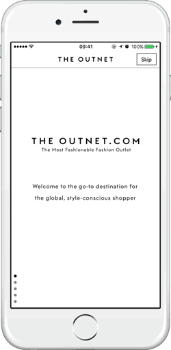
A great example of a retail app that takes all of these points into account is the Outnet.com’s app (right). It has 5 screens and explains the top user benefits that shoppers will experience. Also, it features a CTA at the end of the journey encouraging users to sign in or register with the option to leave at any point.
The value of onboarding to retailers and their app users is clear to see. We look forward to seeing how our clients put them to work!
About Oli

Oli or Olivier has worked in the design industry for 10 years. He gained his expertise as a member of the UX Design teams of well known retailers such as House of Fraser and Selfridges.
Oli is a strong user advocate and believes that empowering users by giving them what they want, will give a strong competitive advantage for retailers to innovate and stand out from the competition. He believes that user experience remains in the details, and that these details create memorable experiences.